Question · answered
What is the best landing page structure for a UK consultant?
By Adam Reeve ·
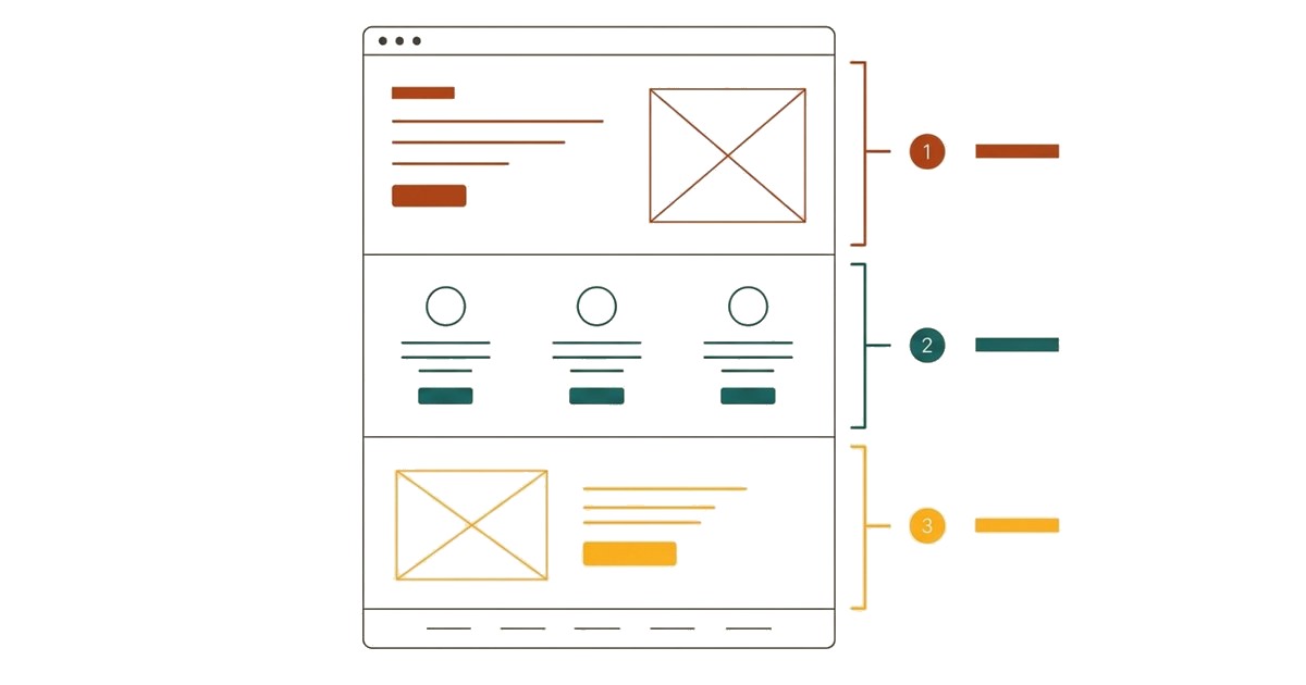
A potential client clicks your ad. They have a problem you can solve, but they’ve never heard of you. Now your landing page has to give them enough reason to stay, believe you and take the next step.
Does it deliver what the ad promised? Can they tell what you do and what they would get? Is there evidence that you can help a business like theirs? Or do they have to book a call just to understand what you’re selling?
The best landing page structure answers those questions in a useful order: a clear proposition that matches the ad, an early reason to trust you, a concrete explanation of the service, relevant proof and an easy next step.
The detail depends on your buyer. A finance director comparing specialist advisers needs different information from a founder hiring a consultant for the first time. Use the structure below to help both do three things: Understand, Believe, Act.
Why generic landing page templates often fail with cold traffic
Someone arriving from an ad or search result may never have heard of you. They lack the context a referral or previous conversation provides. Your landing page has to supply it.
A generic template cannot decide what your buyer needs to know. Follow its layout without questioning it and you can end up with: a big headline, three benefit cards, a logo strip, a founder biography and a booking button, whatever the service.
The result can assume knowledge the visitor does not have and often leaves the user looking for answers and evidence they need before requesting a call or completing a form.
Your goal is to get them on the phone so you can explain the service, answer questions and give them prices. The user needs the answers, belief in the service and benefits before they get on the phone.
We have to start by answering the questions a stranger has, not what we hope they have. Then use the landing page structure to present the answers.
A practical landing page structure
The Buyable Model organizes the buying decision around three stages: Understand, Believe, Act. People need to understand what you sell and whether it is relevant, believe it is credible and worth the money, and find it easy to take the next step.
These are principles to apply throughout the page. You can introduce proof near the headline and repeat the call to action wherever the reader has enough information to proceed.
| Section | The question it answers | Buyable stage |
|---|---|---|
| Message match between the ad or source and landing page | Is this what I was expecting? | Understand |
| Headline and supporting explanation | What do you do, and is it relevant to me? | Understand |
| Early credibility signal | Is there a reason to take you seriously? | Believe |
| The problem and desired outcome | Do you understand what I need? | Understand |
| The service and deliverables | What am I actually buying? | Understand |
| Relevant evidence | Why should I believe this could work for me? | Believe |
| Process, timing and investment | What will working together involve? | Act |
| Focused FAQs | Various questions and objections | Act |
| Calls to action | What do I do next? Is it worth my time? | Act |
The first screen should deliver on the promise that brought the visitor here.
Put the main call to action near the top for visitors who already have enough context. Repeat it after the detail that helps less certain visitors decide. Nobody should have to read the whole page before they can act.
Understand
1. Make the headline explain the service
"Unlock your potential" could describe a consultant, a software platform, a training program or a motivational notebook. A stranger shouldn't have to solve that puzzle.
Your headline and supporting sentence should establish three things:
- What kind of work you do
- Who or what situation it is for
- The problem you solve or the outcome you help achieve
For example:
Cash flow forecasting for UK consultancies planning their next hire.
Supporting copy could say:
"We build a forecast around your contracts, payment terms and costs, so you can see how a new hire would affect your cash position before you commit."
The reader can picture the work and why they might need it. You don't have to fit everything into one sentence. A short category label, headline and supporting paragraph can do the job together.
✕ Vague
Unlock your potential
Learn more✓ Specific
Cash flow forecasting
Cash flow forecasting for UK consultancies planning their next hire
See how a new hire affects your cash position before you commit.
Book a 20-minute project discussionMatch the promise that brought people there. If your ad promises help with cash flow forecasting, the page should continue that conversation. A broad headline about "financial transformation" creates doubt at the moment someone is checking they've arrived in the right place.
Check your page: If someone saw only the landing page, could they explain what you sell and the benefits?
2. Describe the problem in the buyer's language
Once people understand the service, show that you understand why they might need it.
Skip generic frustrations such as "feeling stuck" or "wanting clarity". Describe the situation that makes your service useful. For the cash flow consulting example:
- The business looks profitable, but its bank balance is unpredictable.
- Client payment dates make hiring decisions difficult.
- The founder cannot see how much cash a new contract will require before payment arrives.
Then connect those situations to what the service helps them do. There's no need to exaggerate consequences or manufacture anxiety. Explain the practical change your work supports.
Check your page: Would your intended client recognize their situation, or could this section belong to almost any consultant?
3. Show what the client actually gets
"Confidence, clarity and growth" leaves the important questions unanswered. Is the client buying a workshop, a report, ongoing advice or hands-on implementation?
Describe the service in tangible terms:
- The work you carry out.
- What you need from the client.
- The deliverables they receive.
- What you help them implement.
- What sits outside the scope.
Connect each deliverable to a useful outcome. A cash flow forecast is a deliverable. Being able to compare hiring scenarios is one reason it is valuable.
Where possible, show a sample. An anonymized report extract, project plan or screenshot makes an unfamiliar service easier to picture. If clients often confuse two of your services, explain how to choose between them. Different names and prices aren't enough.
Believe
4. Establish credibility early
Give a cautious buyer something specific and checkable. Nielsen Norman Group's research identifies professional presentation, upfront information, useful current content and connections to external sources as factors in website credibility.[1]
For a consultancy, useful signals include:
- Relevant experience with the buyer's sector or type of problem.
- A named consultant and a clear account of who delivers the work.
- Current qualifications or memberships, where relevant.
- Links to independent reviews or professional profiles.
- Clear information about pricing, scope and delivery.
Choose the signals that answer your buyer's likely concern. A design award does little for someone hiring a specialist in operational risk.
Place one short, relevant signal near the headline. Give the fuller picture later.
"World-class expertise that transforms businesses" leaves the buyer to guess what that means in practice. A factual statement about relevant experience, followed by a concrete example, gives them something to judge. Use only claims you can back up. If your experience comes from a previous employer or business, say so. A logo shouldn't imply a company hired your current consultancy when it didn't.
5. Put evidence beside the doubt it resolves
A testimonial section at the bottom is easy to add. Place evidence beside the claims and decisions it helps the reader assess.
| Placement | Evidence to consider | The doubt it addresses |
|---|---|---|
| Near the headline | A short, relevant client quote or credential | Is this worth my attention? |
| Beside a specific claim | A case example supporting that claim | Have they done this before? |
| Beside the process | Feedback about communication or delivery | Will working with them be difficult? |
| Near the final CTA | A quote about the engagement's value | Is this step worthwhile? |
Choose relevance over volume. One detailed example from a client with a similar problem can answer more questions than a row of unexplained logos.
✕ Evidence dumped at the end
✓ Evidence beside each doubt
A useful case example covers the starting situation, the work, the outcome and the time it took.
Attribute testimonials with name, role and business where permission allows, and link to the original review.
Never invent a quote to fill a template. If you don't have testimonials yet, show the quality of your thinking through a worked example, a sample deliverable or a clear explanation of your approach.
6. Make the practical details clear for UK buyers
You do not need to assume every British buyer thinks alike. Give a cautious buyer specific information they can check, and make the practical details of working with you clear:
- Clear currency and tax information. If you charge UK clients in pounds, show that and explain the applicable VAT position.
- An identifiable business. Make it easy to find your business details and contact you.
- A clear privacy notice. Link to it from forms so visitors can understand how you use their information.
- Professional memberships and insurance. Where they're relevant to the work.
- Working hours and time zone. Especially on the booking page.
These details support the main proposition by reducing uncertainty about who you are and what working with you involves.
Act
7. Explain the process, timing and investment
Before booking, people want to know what hiring you would involve. Show the stages in plain language:
- 1.Assess the situation: Review the relevant information and agree the problem to address.
- 2.Do the work: Explain what you analyze, create or change.
- 3.Review and implement: Show how recommendations become decisions or completed work.
Include realistic timing, how much of the client's time it takes and who is responsible for implementation.
If you can publish a fixed price, say what it includes. If scope varies, give a meaningful starting price, a typical range or an explanation of what determines the fee. Don't publish a low entry price that doesn't reflect what most clients need.
If you can't give a useful figure before a conversation, say what you need to price the work and when the buyer will get a proposal.
8. Use FAQs to resolve real objections
An FAQ should help someone decide whether to proceed. Useful questions include:
- Do you work with businesses at our stage?
- What will you need from me?
- How much of our team's time will this take?
- Will you implement the recommendations?
- What happens after the initial project?
Use questions and objections you actually hear in sales conversations. And keep essential information in the main landing page content.
9. Make the next step easy
"Book a discovery call" tells people very little. Explain the purpose, length and likely outcome:
Book a 20-minute project discussion
"Tell us what you need to improve. We'll discuss whether the service fits and explain the next steps if it does."
Describe the call accurately. Don't promise a free strategy session if it's mainly a qualification call.
✕ Tells people little
Book a discovery call✓ Sets expectations
Book a 20-minute project discussionWe'll discuss whether the service fits and explain next steps if it does. Times shown in UK time.
Choose one main action that suits the service and the visitor's readiness: booking a conversation, requesting a proposal or buying a defined diagnostic. A secondary link to a case example can help visitors who need more evidence first. Keep it visually quieter.
Then check the whole booking journey:
- Ask only for what you need at this stage.
- Explain why you need anything sensitive or demanding.
- Make form labels and errors clear.
- Show calendar time zones.
- Offer an alternative if no slot suits.
- Confirm the booking worked.
- Say when and how you'll respond.
Test it on a phone. A persuasive page loses its value if the form fails on mobile.
10. Check your page works for strangers
Your team knows what you mean, which makes internal feedback a poor test of clarity. Ask people unfamiliar with the business to review the page without an introduction. Get a first impression, then let them explore.
Ask neutral questions:
- 1.What do you think this business sells?
- 2.Who is it for?
- 3.What would you expect to receive?
- 4.What makes you doubt it?
- 5.What would you need to know before getting in touch?
- 6.What would you do next, and what would you expect to happen?
Avoid asking whether the page is "clear and convincing". People can agree without being able to explain the proposition. Look for misunderstandings and repeated questions instead. If several people can't tell whether implementation is included, you've found a specific fix.
Buyable's Six Strangers Test puts your page in front of six people unfamiliar with your business. Their responses help reveal what people understand, what creates doubt and what information is missing.
Where participants differ from your intended clients, use their feedback to assess clarity rather than infer demand. If the problems extend across the buying journey, Buyable's Experience Redesign can help identify and prioritize what needs to change.
11. Measure behavior
Feedback from six people can't guarantee a conversion uplift when cold traffic hits the landing page. It can reveal misunderstandings and obstacles worth investigating.
After making changes, track the journey from relevant visits to CTA clicks, bookings, qualified conversations and, where practical, won business. More leads are not necessarily better if fewer are suitable. With enough traffic and conversions, a properly designed A/B test can help measure impact. With lower volumes, combine feedback with observed behavior and lead quality.
The final test is simple. Can a suitable stranger understand the service, find a credible reason to consider it and complete the next step without you explaining anything?
Find out what strangers understand about your page
Six people who have never heard of your business review your page and tell you what confuses them and what makes them hesitate.
References
- [1] Nielsen Norman Group, Trustworthiness in Web Design: 4 Credibility Factors.